The 2018 FIFA World Cup provides Russia with an almost universal showcase and thus an unprecedented opportunity to overhaul its international image. Renovated stadiums, fan friendly areas, global media coverage, etc. everything must give a modern and attractive face for tourists and investors. The unexpected victories of the Sboarnaïa add a popular touch to the picture.
The three « icons » chosen by Russia to symbolize this competition are meant to promote a new « Russian brand » worldwide. Let us take stock of the messages sent to the public opinions by the three pictures chosen to be the symbols of the competition. By selecting them, Russia and FIFA chose to display three main features of today’s Russia
1. The Official logo and the “globalized Russia”

Selected through an international tender process, created by a Portuguese agency located in Lisboa, Brandia Global, unveiled on October 28th, 2014 from the International Space Station by Russian astronauts and displayed on the facade of the Bolshoi Theater in Moscow, this image has all the attributes of a globalized and standardized marketing production: taking up the world-famous silhouette of the trophy, it gives the culture of the organizing country only a folkloric place.
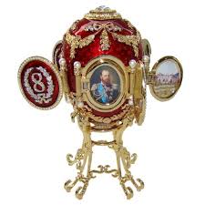
The Golden features are supposed to be a hint to the religious icons and the red color a symbol of the Russian culture (and the Soviet era?). I has also some of the features of a Fabergé egg, famous during the imperial era (cf. photograph below).

If Sepp Blatter declared that the logo embodied the Russian « soul », it was that it conformed to FIFA’s specifications. A precisely packaged brand to embody a modern country! Yet that symbol is in some way paradoxical because of its context: intended to embody a Russia well integrated in the international community (at least in sport), it was displayed at the very moment of the break with the international community, a few months after the annexation of Crimea on 18 March 2014.
2. Zabivaka and the Russian re-emerging power

The mascot is also a symbol of hospitality and modernity. Meaning literally « who scores (goals) » is an anthropomorphic wolf looking like a manga character, wearing orange glasses and equipment in the colors of Russia.
Designed by Ekaterina Bocharova, Zabivaka was chosen by viewers of the public television channel Pervyi Kanal, October 22, 2016. It embodies the normalization of Russia but it can be perceived two ways.
To Westerners, wolf is a predator that can symbolize the aggressiveness of the Russian foreign policy. To Russians, the Gray Wolf (Seryi Volk in Russian) is a positive character in folk. Far from being the dangerous like in the Little Red Riding Hood tale, the Gray Wolf is often in Russian tales a totemic animal that helps young heroes in their trials.
Zabivaka is in any case the symbol of misunderstanding between East and West.

3. The official poster and the Soviet heritage
The third symbol of this World Cup is the legendary goalkeeper Lev Yachine, the only Soviet player to be awaerded the Golden Shoe. This poster highlights another face of the country: the continuity between the present time and the tradition of high level sport developed by the USSR after WWII.
The graphic design of the poster mimics that of the propaganda posters of constructivists like El Lissitsky. As for colors, they are borrowed from the last period of Stalinist propaganda. Sputnik’s silhouette, the first artificial satellite ever sent into space in 1957, is a real Soviet pride.
Here again the symbol is rich but ambiguous: a protective and reassuring figure (a goalkeeper) recalls the red line that unites the current regime to the Soviet system. Far from breaking with the USSR, Russia’s 2018 World Cup claims this heritage – and therefore its global ambitions?
The three symbols of the World show the world three faces of Russia. Attractive but ambiguous. In search of a new place on the international scene. And probably also a new identity.


